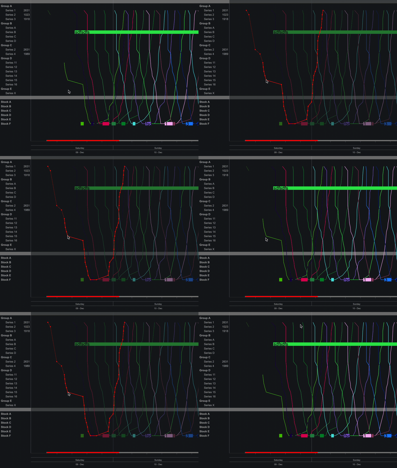
Stringline Schedule
Data
Data for the Stringline component is provided in two separate sets: one is used to plot the lines, and the other to render all other items, such as points, bars, etc.
Properties
By Groups
Data
Data Format (Data)
JSON or SDD
Line Data (Data)
Used to render lines with points. Please refer to the Keys section for a list of all columns that can be used for line data.
The chart in this screenshot represents data that uses only line data, with the 'Display line points on hover' property set to true.
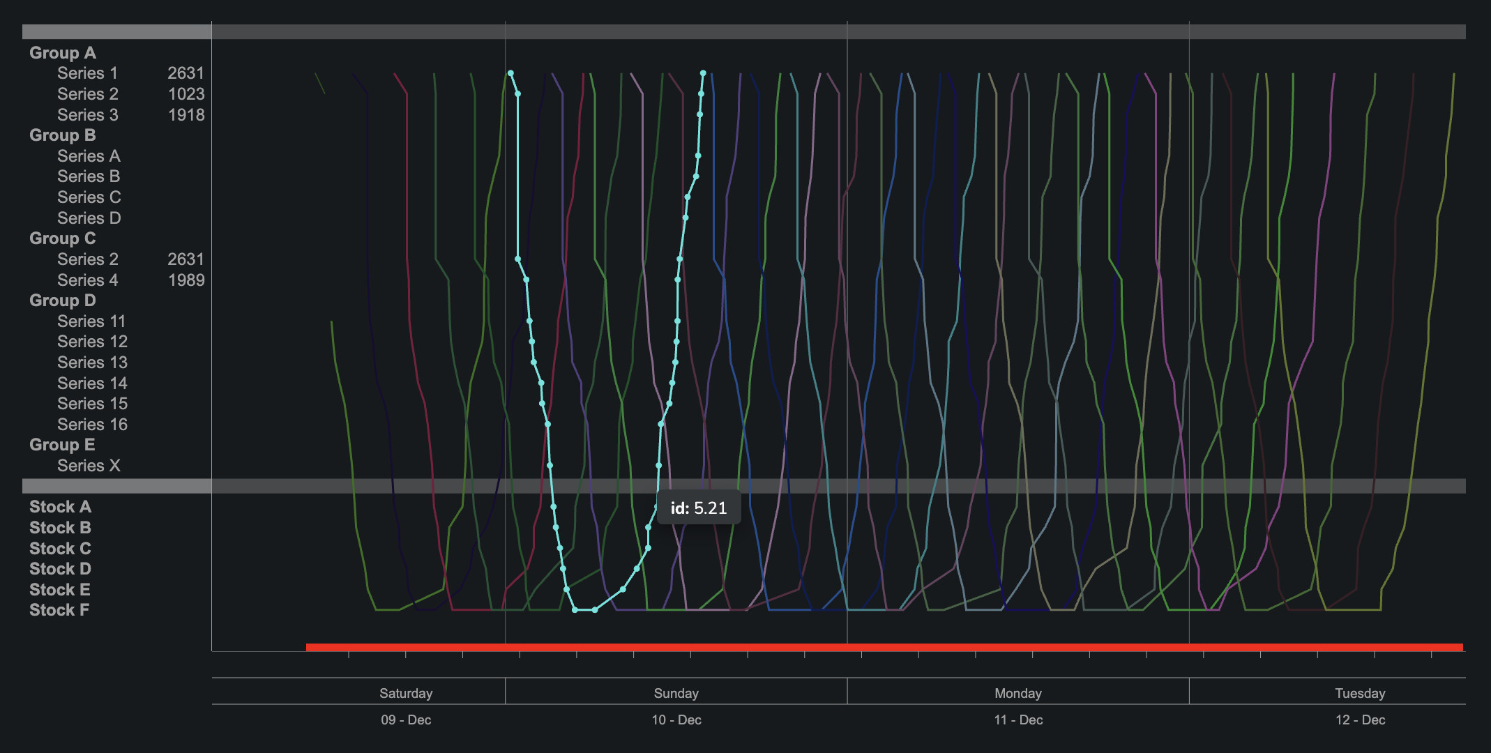
Example data set:
{
  sddFormat: 'sdd/table/object-of-arrays',
  version: '1.0.0',
  definitions: {
    id: {
      kind: 'string',
      optional: false,
    },
    idx: {
      kind: 'string',
      optional: false,
    },
    name: {
      kind: 'string',
      optional: false,
    },
    time: {
      kind: 'integer',
      optional: false,
    },
    label: {
      kind: 'string',
      optional: true,
    },
  },
  data: {
    id: [
      '0.0',
      '0.1',
      '0.2',
      '0.3',
      '0.4',
      '0.5',
      '0.6',
      '0.7',
      '0.8',
      '0.9',
      '1.0',
      '1.1',
      '1.2',
      '1.3',
    ],
    name: [
      'chain1',
      'chain1',
      'chain1',
      'chain1',
      'chain1',
      'chain1',
      'chain1',
      'chain1',
      'chain1',
      'chain1',
      'chain2',
      'chain2',
      'chain2',
      'chain2',
    ],
    idx: [
      1,
      1.5,
      3.2,
      4.8,
      10.2,
      10.2,
      7,
      6,
      5,
      3,
      7,
      3,
      2,
      1,
    ],
    label: [
      'T 432',
      undefined,
      undefined,
      undefined,
      undefined,
      undefined,
      undefined,
      undefined,
      undefined,
      undefined,
      'B 543',
      undefined,
      undefined,
      undefined,
    ],
    time: [
      1703886400, 1704139200, 1704182400, 1704182400, 1704268800, 1704528000,
      1704614400, 1704787200, 1704787200, 1704873600, 1705268800, 1705528000,
      1705614400, 1705787200,
    ],
  },
  tableConstraints: {
    validity: 'enforced',
  },
}
Point Data (Data)
Used to render points. Please refer to the Keys section for a list of all columns that can be used with point data
Data represented on this screenshot utilizes various types of points, with some examples provided below. Only point data is used in this chart.
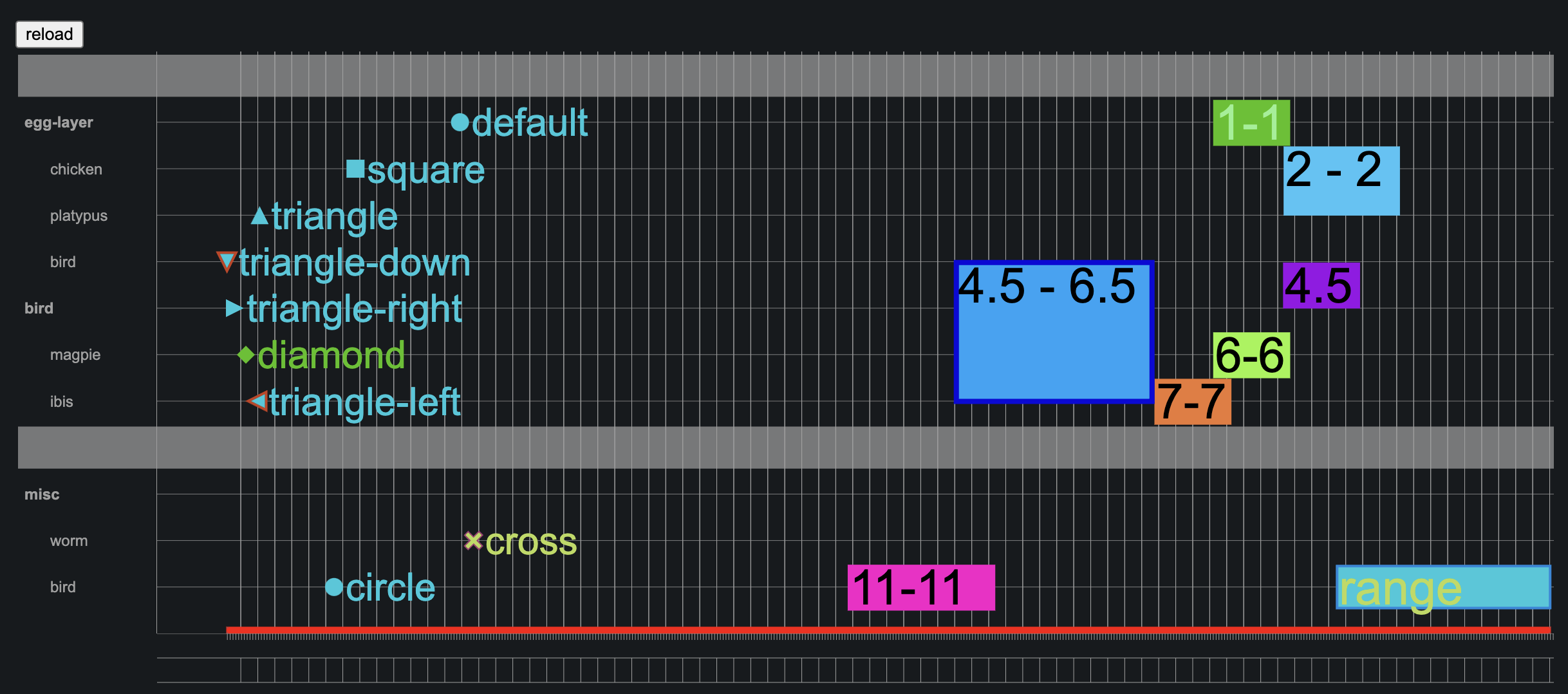
Example objects:
  // green diamond

  {
    id: 'point-0370a7cec8ae',
    color: '#4BC200',
    time: 1702815789,
    duration: 391428,
    label: 'diamond',
    type: 'point',
    pointType: 'diamond',
    size: 14,
    locked: false,
  },
  // blue spanning-range spanning from 4.5 to 6.5

  {
    id: 'point-6',
    color: '#00a5f7',
    time: 1703815789,
    duration: 591428,
    comment: '4.5 - 6.5',
    type: 'spanning-range',
    fromIdx: '4.5',
    toIdx: '6.5',
    locked: false,
    strokeWidth: 8  ,
    strokeColor: '#0b09db'
  },
  // spanning range that is 1 row height grouped with point-1

  {
    id: 'point-2',
    color: '#98f542',
    time: 1702815789,
    duration: 391428,
    comment: '6-6',
    type: 'spanning-range',
    fromIdx: '6',
    toIdx: '6',
    locked: false,
    dragGroup: {ad: ['point-1']}
  },
Series Data (Data)
Add/Remove
To remove an element, use the Selected Elements property. When an element is selected, a bin icon appears in the bottom left corner that allows you to remove the element from the Point Data set.
Add Mode
By default the mode is set to normal
{ type: 'normal' }
To switch to 'add' mode, the value must be set to add, and a props object, which will populate the data, must be provided. Example:
  {
    type : "add",
    props : {
      type : "point",
      label : "hello",
    }
  }
Add mode offers the following properties, which are merged with the provided props (note that user-provided props take priority over 'automatic values':
timeidxfor types other than 'spanning-range'fromIdxifmode.props.typeis set to 'spanning-range'toIdxifmode.props.typeis set to 'spanning-range'
After setting the value to the object described above, the user can add a new element by clicking on the chart.
Render
Dynamic element height (Render)
Setting this property to 'true' will cause the chart to disregard the Row Height property and instead calculate it based on the number of rows and available space. Warning: This setting may lead to undesirable outcomes when the number of series is disproportionately high relative to the available height!
Row height (Render)
default: 20
Displayed when Dynamic element height is set to false
Fill vertical space (Render)
Ensures that the chart is vertically stretched to use all available space.
Line smoothing (Render)
Options:
- Linear - Produces a polyline through the specified points. https://d3js.org/d3-shape/curve#curveLinear
- Smoothed - Produces a cubic spline that preserves monotonicity in y, assuming monotonicity in x, as proposed by Steffen in A simple method for monotonic interpolation in one dimension: “a smooth curve with continuous first-order derivatives that passes through any given set of data points without spurious oscillations. Local extrema can occur only at grid points where they are given by the data, but not in between two adjacent grid points.” https://d3js.org/d3-shape/curve#curveMonotoneX
Display line points on hover (Render)
Current Time
Properties used to determine if additional vertical line should be displayed. By default it uses current time. It could be overwritten to custom value (e.g. for debugging purposes) by setting Override and Override value props
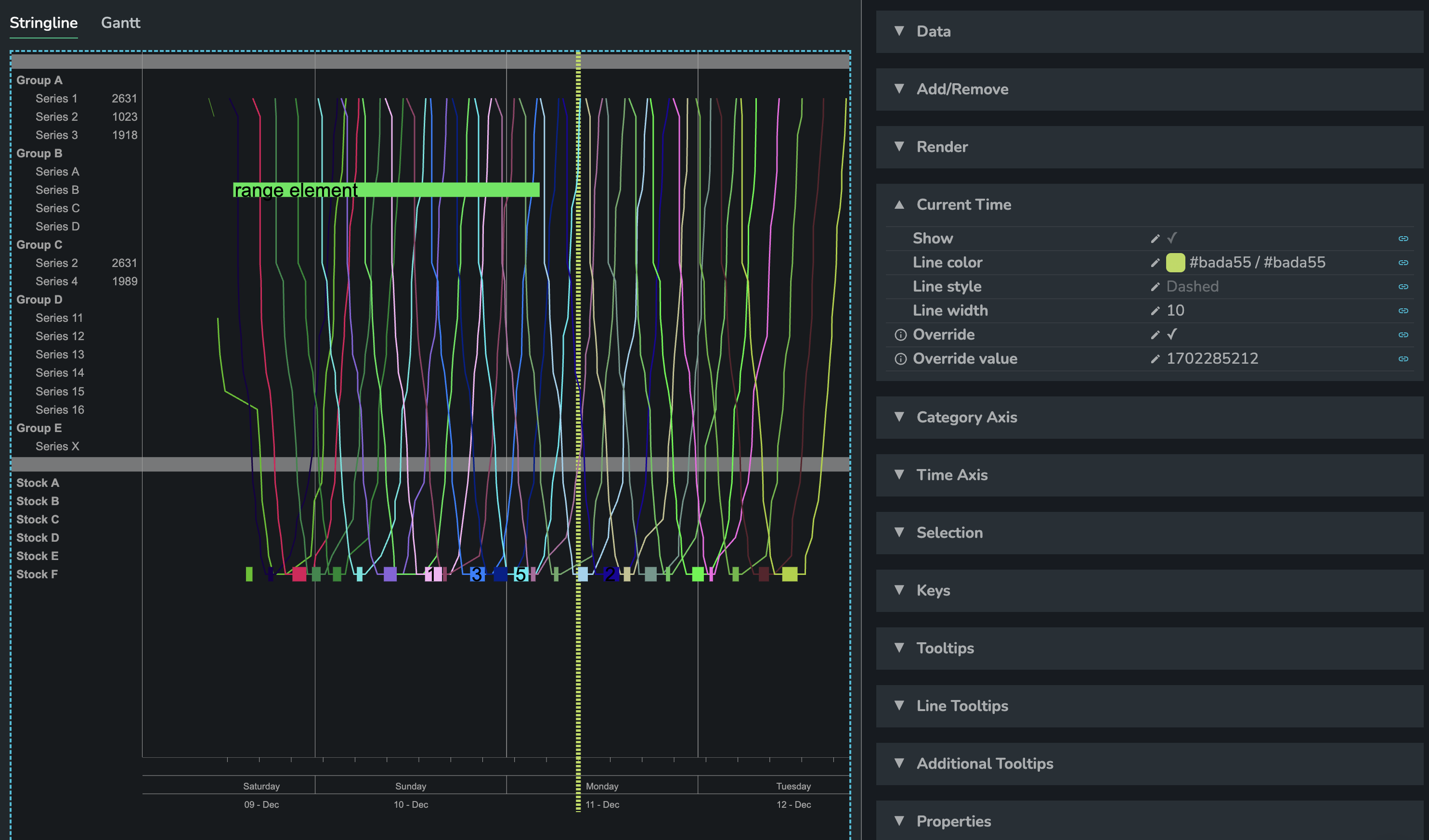
Show
Line color
Line style
Options:
- Dashed (default)
- Solid
Line width
Override
Allow to override current time with custom value
Override value
Value [timestamp in seconds] to override current time with
Category Axis Section
Enable Scroll
Enable Panning
Allows moving the viewport to visualize other areas of the content, typically done using the scroll bars. To pan the graph, press and hold the mouse button on the chart's background. The viewport content will move along with the scroll bars.
Font size
Show lines
Time Axis
Time Axis
Configuration object for Time Axis
- format accepts date-fns format (so it is Unicode Date Field with few additions)
example:
[
  {
    step: 'hour',
    stepSize: 4,
    stepStart: 1,
    format: 'kk:mm',
    fullHeight: false,
    ticksOnly: true,
  },
  {
    step: 'day',
    stepSize: 1,
    format: 'EEEE',
  },
  {
    step: 'day',
    stepSize: 1,
    format: 'dd - LLL',
    fullHeight: true,
  },
]
Enable Scroll
Enable Panning
Enables the viewport to be moved to visualize different areas of the content, typically using the scroll bars. To pan the graph, press and hold the mouse button on the chart's background. The content of the viewport, along with the scroll bars, will move accordingly.
Persist Scroll
The next property, Scroll store, allows scroll positions to be persisted between sessions.
Scroll store
Font size
Show Weeks
Show Hours
Show Day Names
Show Days
Selection
Selected elements
Enables linking of selected elements to storage.
Hovered Element
Enables linking to the last hovered element, which may affect performance.
Double clicked Element
Allows linking to the last double-clicked element, which may affect performance.
Keys
Matches the provided data structure to the expected data structure. Provide the names of the keys in your dataset that correspond to the values expected by the chart.
- id: used internally to perform various operations e.g. drag and drop. Should be unique to every entry.
- idx: determines where element should be placed on category axis. Accepts values up to 2 decimal places.
- name: used as an aggregator value - to group values (entries) into one line, it's never rendered anywhere.
- color: color of an element/line segment; any value that is HTML/CSS compatible => hex, rgb(a), names like 'red', 'aquamarine'
- time: used to place elements (points, range) on time axis. The time values are seconds from epoch
- family: used to group series. It creates empty row in category axis to visually distingush series
- lineStyle: 'style of the line: solid or dashed',
- lineWidth: 'width of the line in pixels',
- size: 'size of points and line points in pixels',
- duration: 'used for range and spanning-range - duration of an event'. The value is in seconds,
- label: renders text for the element, both for points and lines,
- labelColor: 'color used for text for range and spanning-range',
- type: 'type of element: point, range, spanning-range',
- pointType: 'subtypes of point: diamond, circle, square, triangle, triangle-down, triangle-left, triangle-right, cross',
- strokeWidth: 'used for points only - all types',
- strokeColor: 'used for points only - all types',
- alwaysVisible: boolean value used for line point determining if the circle should be rendered for this point and if it should be always visible (other case is that points could be visible with 'display line points on hover' setting),
- locked: 'boolean key used to lock point or element from being dragged',
- fromIdx: 'used by spanning-range point type to indicate where is the start of the spanning-range element',
- toIdx: 'used by spanning-range point type to indicate where the spanning-range should end',
- highlightColor: 'used for lines only to change highlight color',
- dragGroup: 'used to combine few elements into one drag group',
- custom: used to store custom data, not needed by stringline component, but useful for other things
Tooltips
Enabled
Enable or disable tooltips for all data points.
Config
Format for a simple tooltip. Specify a suffix or prefix and set the decimal places.
{
  "prefix": "",
  "suffix": "",
  "multiplier": "auto",
  "decimalPlaces": 1,
  "capitalize": true,
  "useLocale": true
}
Column Config
Construct a custom tooltip by combining data from various columns in the source data.
- Column - Column from the data source to display in the tooltip.
- Label - Alias to display instead of the column name.
- Apply To All Series - Should this column tooltip be displayed for all series?
- Applies To Series - Which series should this tooltip schema apply to.
- Prefix - Tooltip prefix.
- Suffix - Tooltip suffix.
- Data Type - String, Number, Date, Date Time
- Multiplier - Converts the value to the chosen multiplier. For example, the option "Thousands" would convert the value "1000" to "1k".
- Decimal Points - Decimal points to add to the number.
- Capitalized Multiplier - Capitalizes the multiplier value.
- Locale Used - Should the tooltip be formatted based on user locale?
Position
Defines the position of data labels, which can be left, right, or center. The default position is left.
Features
Group drag
There is a new data key called dragGroup (which can be modified in the keys properties). This key accepts the format { ad: [], d: []}, where ad represents additional data (ranges, points, spanning-ranges) and d represents data (lines), each being an array of element IDs. These elements must reference each other to function correctly in a group. For example, if range ID A includes range ID B in its drag group, dragging range A will also move range B. However, if range B does not reciprocally specify range A, then dragging range B will not affect range A. Therefore, the correct setup for mutual interaction is: { id: A, dragGroup: { ad: [ B ] } }, { id: B, dragGroup: { ad: [ A ] } }.
Hover Highlight
There’s a new data key called highlightColor (modifiable in the keys properties) where you can specify the highlight color directly in the line definition. To hide parts of the line, set these sections to transparent; they will disappear and only appear colored with the highlightColor when hovered over.